SPY TECHNICALS
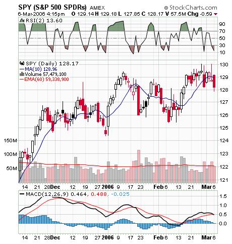 The SPY chart above is starting to look, well yes, like a trading range. The 2 day RSI is at about 14 so if there is morning weakness I intend to buy. However, I do not like the looks of the market so I anticipate it will be a quck flip. Also, note on the MACD indicator below the chart that as the SPY makes higher highs, the MACD lines make lower highs. That is a BEARISH NEGATIVE DIVERGENCE.
posted by DAVID at
6:46 AM
![]()


1 Comments:
Interesting chart patters.
Post a Comment
Subscribe to Post Comments [Atom]
<< Home